Business Intelligence
Written By: Sajagan Thirugnanam and Austin Levine
Last Updated on October 28, 2024
Data is now everywhere! Every interaction we have on our smartphones and laptops are data which can be turned into meaningful insights for a business. And with more and more data, we need a way to present this data in a concise and meaningful manner.
This is where data dashboards can play a pivotal role in shaping our view of data. A data dashboard is essentially an interactive tool that lets us track key metrics and KPIs in relation with dimensions which are most important to a business. Data dashboards have completely transformed how companies rely on business intelligence to make strategic decisions to drive a business forward.
In this article, we will take a deeper look into data dashboards, what they can achieve and examples of some dashboards which are most commonly used in today’s data dependent world.
What is a Data Dashboard?
A data dashboard is an interactive portal whereby you can visualize your data according to the business requirement using different charts and graphs with the help of several visualization tools such as Power BI, Looker Studio, Tableau etc.
The purpose of a data dashboard is to bring data from different sources and combine it to visualize the data. This is important so we can track and measure how different KPIs are performing over a time period. We can also monitor real time data which is important for continuous monitoring and enhancement of key performance indicators.
Without data dashboards, businesses would be left with huge piles of unstructured numbers and data which would end up to mean nothing without the proper tools to structure it.
Benefits of a Data Dashboard?
Data dashboards bring in great advantages for a company such as:
Structure and visualize messy unstructured data: Previously, businesses would create manual Excel based reports which would try to structure these mass volumes of data. With the help of powerful dashboarding tools such as Power BI, we are now able to create powerful visuals from the same data with the help of ETL processes and data modeling. To learn more about data modelling practices, click here.
Track and analyze KPIs and metrics to help gauge progress. This lets us set realistic targets we can aim for which ultimately creates positive value for the organization.
Improved decision making with well designed dashboards to help in the storytelling process. Data dashboards are the main tool which most data driven companies use to make their strategic calls to help improve the overall performance of the organization.
Help in forecasting with predictive analytics and time series data to help predict future outcomes based on historical and current data. This helps us create more accurate forecasts and identify key time periods where businesses can grab opportunities.
Data Dashboard Examples
Here are some examples of data dashboards which are useful for different business teams:
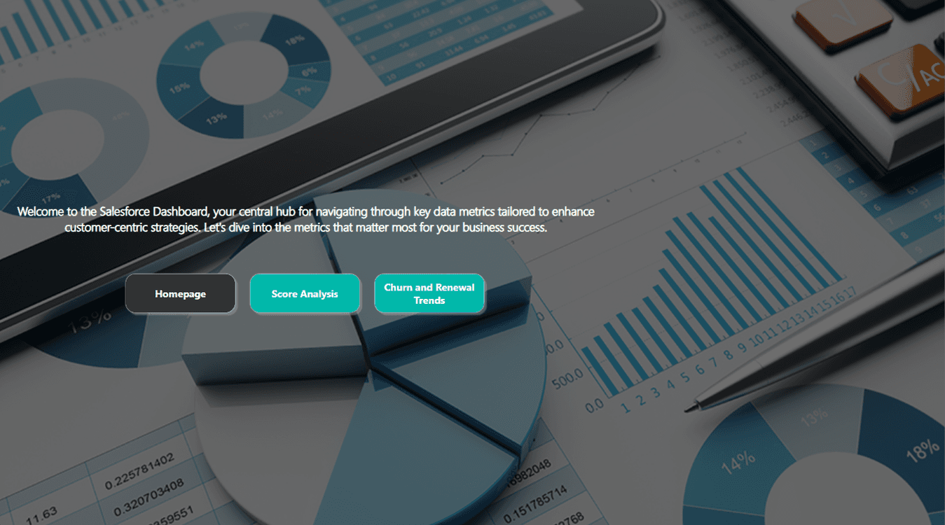
Customer Service Dashboard
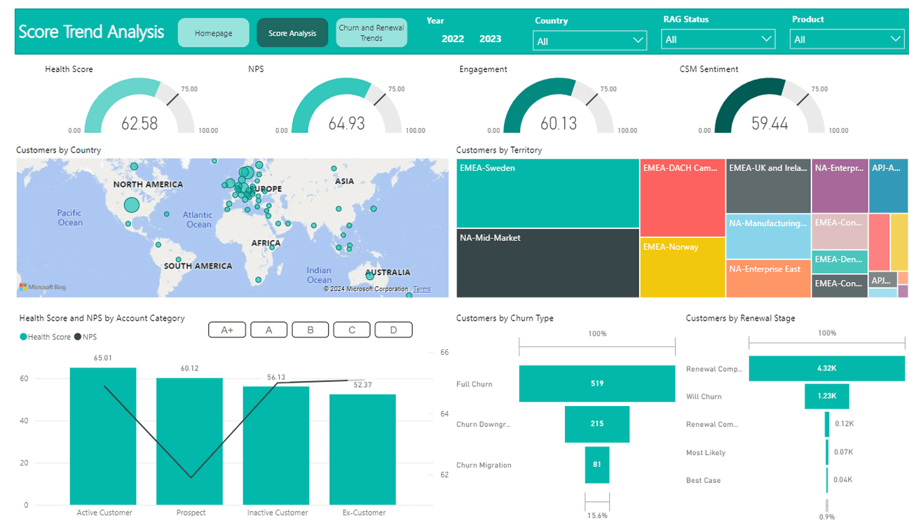
Creating a customer service dashboard means you need to consider that it meets the needs of the team and effectively tracks the KPIs and metrics which are most important to the CX department.
These are some key metrics which are often common to a Customer Service Dashboard:
Metrics such as health score, NPS, engagement rate etc
Ticket volume and resolution time
Agent level information
Churn and Renewal Rates
These are just some top level data points which can be very crucial to a Customer Service dashboard. However, the full length of visualizations to be used in such a dashboard would vary based on some of the things we discussed previously in this blog such as target audience, business requirement etc.
Campaign Monitoring Dashboard
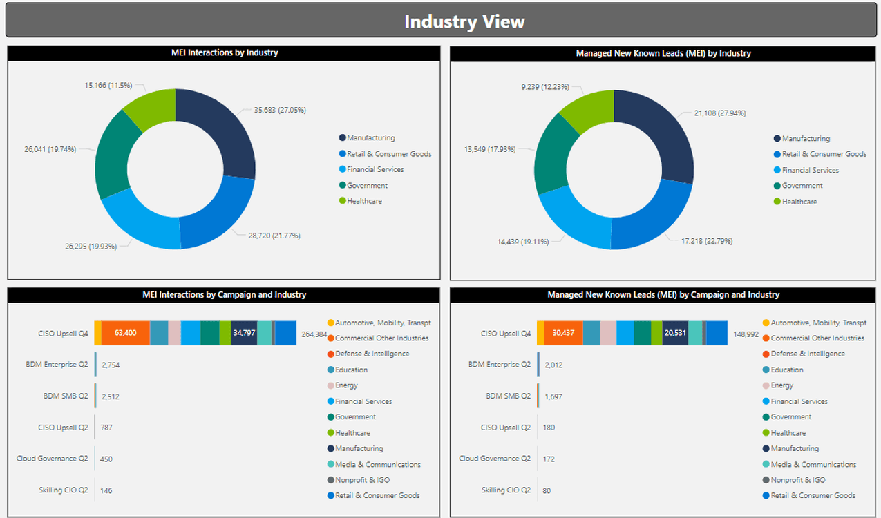
Here is a snapshot of a campaign monitoring dashboard.
This allows us to track the performance and effectiveness of marketing campaigns. Here are the key features which are required for such campaign monitoring dashboards:
Conversion Rates
Click Through Rates
Engagement Metrics
KPI Benchmarks
A/B Testing results
Integrating these key KPIs and metrics help make the campaign monitoring process much simpler for the campaign manager and team!
Management KPI Dashboard
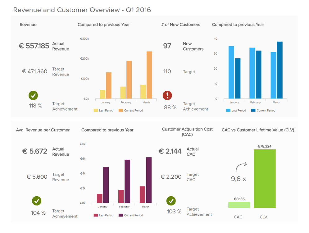
Source: datapipeline.com
These types of dashboards are for the top level executives of a company. The people who run the business and just want top line numbers such as:
Target vs Actual Revenue
Customer Acquisition in platform
Revenue per Customer
Customer Lifetime Value (CLV)
Comparison to previous period
The chief executives make multiple business decisions daily and having the right intel in the right format can often be the difference between the outcome of a company and its future!
High stakes stuff, isn’t it?
Environmental KPI Dashboard
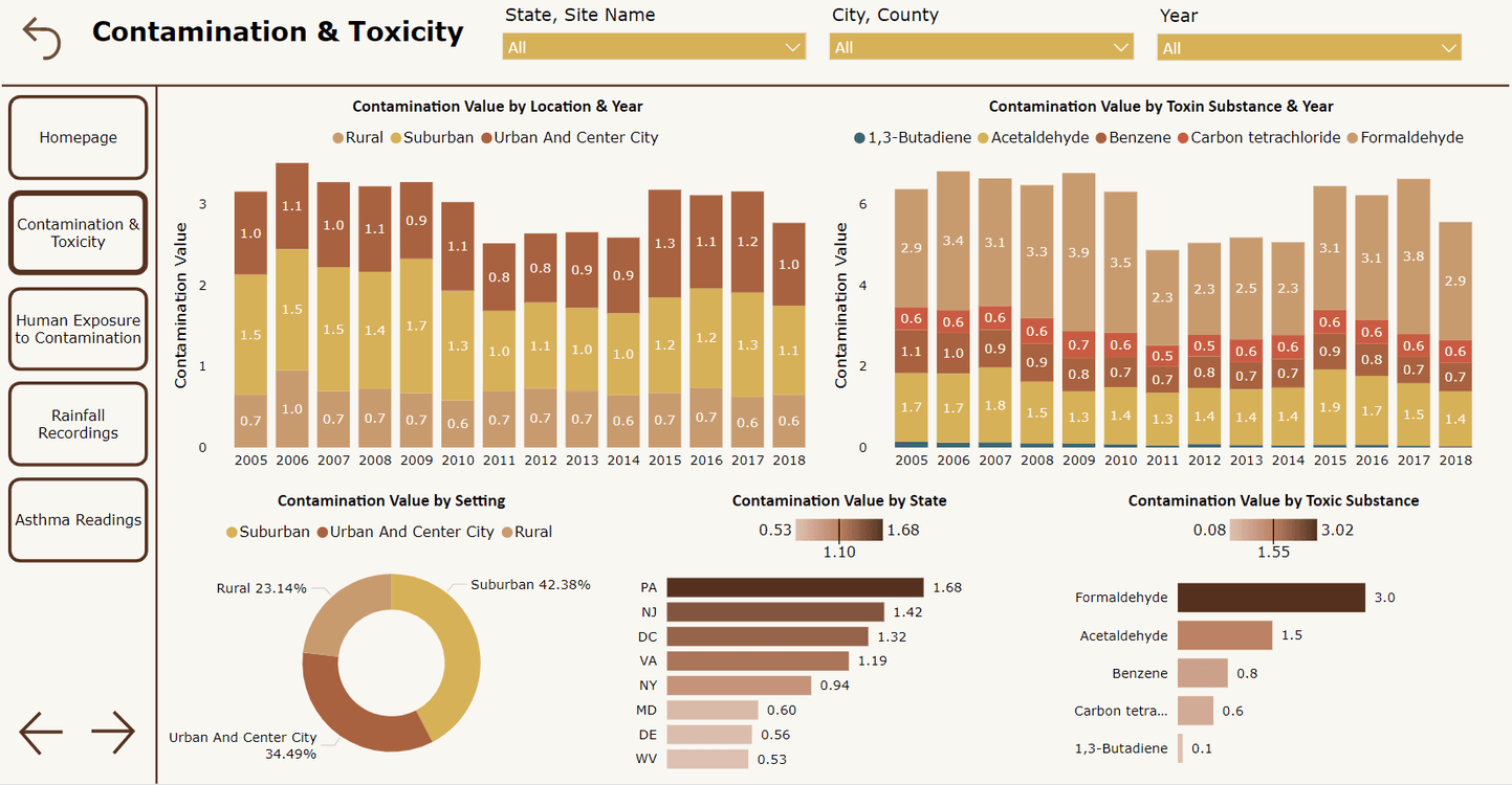
These types of dashboards are used by organizations to monitor, visualize and manage their environmental performance. These dashboards compile various metrics that reflect the organization's impact on the environment, helping to track progress towards sustainability goals and regulatory compliance.
For more such dashboard examples, you can read this blog.
Common Challenges & Mistakes of Data Dashboarding
While creating a dashboard, we must keep in mind some basic guidelines to stay away from bad practices.
Static Dashboards
Static dashboards in Excel spreadsheets are a thing of the past. Now we create dashboards using modern tools such as Power BI which lets us interact with the dashboard and drill down into the data to extract deeper insights.
So next time you create a dashboard, keep in mind that the best dashboards are interactive and allow a user maximum flexibility to slice and dice the data using filters and other cross filtering methods.
Overcrowding The Dashboard
One of the biggest mistakes young budding analysts make is overcrowding the dashboard with too much information. This can make it very difficult to extract anything meaningful from the dashboard. Our brains work best when we work in a clean, tidy setup. The same is applicable here.
No Alloted Time For Validation
Another thing to keep in mind is testing and bug fixes. Data is meaningless if it lacks accuracy. Moreover, oftentimes dashboards in Power BI can break in formatting when we publish the dashboard. These are all easy fixes only if we allot time for testing and bug fixes after we are done with the initial setup and creation of the dashboard.
Ignoring Mobile Design
With the advancement of smartphones in the last decade, it is now vital that we design our dashboard for mobile versions as well!
Ignoring this can limit the user accessibility of our dashboards and eventually may require double work when the requirement arises in the future. So let’s save time and design the dashboard for smartphone screens as well!
Ready To Start Creating Your First Dashboard?
Data dashboarding is an essential skill set to have in the world of data today. Now that you know what a data dashboard is, it’s time to look into the technical aspects of how to build a dashboard from scratch. Remember, dashboarding involves many technical and creative aspects which are crucial to the process of building a new dashboard.
Remember one thing: Data dashboards are not only a medium to illustrate your data but with proper use of these dashboards and actionable insights, you can propel your business to new heights!
To learn how to build a report on Power BI, click here.
FAQs
What are the essential elements of a good dashboard?
A good dashboard includes key performance indicators (KPIs), clear and concise data visualizations, real-time data updates, interactive elements (such as filters and drill-downs), and a user-friendly design. It should provide relevant context and be tailored to the specific needs of its users.
What are the 3 main purposes of a dashboard?
Dashboards are useful for monitoring, measuring, and analyzing relevant data in key areas. They take raw data from many sources and clearly present it in a way that's highly tailored to the viewer's needs.
Can you build a dashboard in Excel?
Excel is a super versatile tool to do a bunch of stuff which are data related. You can design a dashboard using Excel as well. Excel can also be used to build data dashboards - however, Excel has its limitations which need to be kept in mind when building the dashboard.
Related to Business Intelligence