Reporting and KPIs
How To Create Financial Reports With Examples
How to build a financial report in Power BI: connect your data, shape it in Power Query, model it, then build the waterfall and variance visuals.
Sajagan Thirugnanam
·
Updated
You build a financial report in Power BI in four stages, then share it. Connect to your general ledger and any supporting finance sources, shape that data in Power Query, model it around a chart of accounts, then build visuals on top of it, typically a variance matrix and a waterfall chart. Once it's built, you share it through a workspace. The steps below cover each stage, plus that sharing step. For what the different report types mean, see accounting reports: definitions and types. For the KPIs a financial report tracks and their DAX, see financial analysis and reporting.
Connect to your data sources
On the Home ribbon in Power BI Desktop, select Get data, then choose a connector. A financial report usually pulls from one of these:
An accounting system export or a general ledger extract, often as an Excel workbook or a flat file, if your finance system does not have a live connector.
A SQL Server or cloud database holding the general ledger tables directly, if finance runs on an ERP with a queryable backend.
Dataverse or another cloud service connector, if the general ledger sits in a platform Power BI connects to natively.
For most general ledger volumes, use Import mode rather than DirectQuery. Import loads a compressed copy of the data into the model, which is what makes the DAX measures in the modeling step below fast, and a nightly or twice-daily refresh is normally fine for a finance report that closes monthly or quarterly.
Shape and transform the data in Power Query
Select Transform data to open Power Query Editor before loading anything into the model. General ledger exports are rarely clean enough to model directly. Common transforms for this data:
Unpivot columns. Many GL exports put each period in its own column (Jan, Feb, Mar...). Unpivot turns those into a Date column and an Amount column, which is the shape a fact table needs.
Merge queries. Join the ledger extract to a chart of accounts file if account names and groupings live in a separate file.
Append queries. Combine multiple monthly or yearly extract files into one table before it reaches the model.
Filter rows. Remove unposted, zero-value, or non-financial rows that would otherwise inflate row counts without adding information.
Change type and rename columns. Set the Amount column to a fixed decimal number, not text, and set the Date column to a proper date type so the model's date table can relate to it.
Build the model
Build the model around the chart of accounts, the same shape described in financial analysis and reporting: a General Ledger fact table plus Chart of Accounts, Cost Center, and Date dimension tables. On the Modeling tab, select Manage relationships, then Autodetect to let Power BI find matching key columns, or New to build a relationship by hand between two specific columns.
Two things worth checking once the relationships exist:
Cardinality. A dimension table like Chart of Accounts should be the "one" side of a one-to-many relationship into the General Ledger fact table. Our guide to relationships and cardinality covers how to confirm this and what breaks when it is set the other way around.
Sort order. If a visual needs the accounts or account groups to appear in a specific order (Revenue before COGS before Opex, for example), add a numeric SortOrder column to the Chart of Accounts table and set the AccountGroup column to sort by it, rather than relying on alphabetical order.
For general modeling guidance beyond relationships, see our data modeling best practices. For the Power Query techniques above in more depth, see our Power Query guide.
Build the variance table
A variance report needs both an actual and a comparison value for each account, usually actual against budget. If your general ledger fact table does not already separate these, add a Scenario column to it (values such as Actual and Budget), so the same table holds both the real postings and the budget load, filtered by that column.
Actual Amount =
CALCULATE(
    SUM('General Ledger'[Amount]),
    'General Ledger'[Scenario] = "Actual"
)
Budget Amount =
CALCULATE(
SUM('General Ledger'[Amount]),
'General Ledger'[Scenario] = "Budget"
)Variance =
[Actual Amount] - [Budget Amount]Variance % =
DIVIDE([Variance], [Budget Amount])Add a Matrix visual, put AccountName on rows, and add Actual Amount, Budget Amount, and Variance % as values. Then select the Variance % column in the matrix, open Format your visual > Cell elements, and add a color scale or icon rule, such as red below zero and green above zero, so a reader can scan the column instead of reading every number.
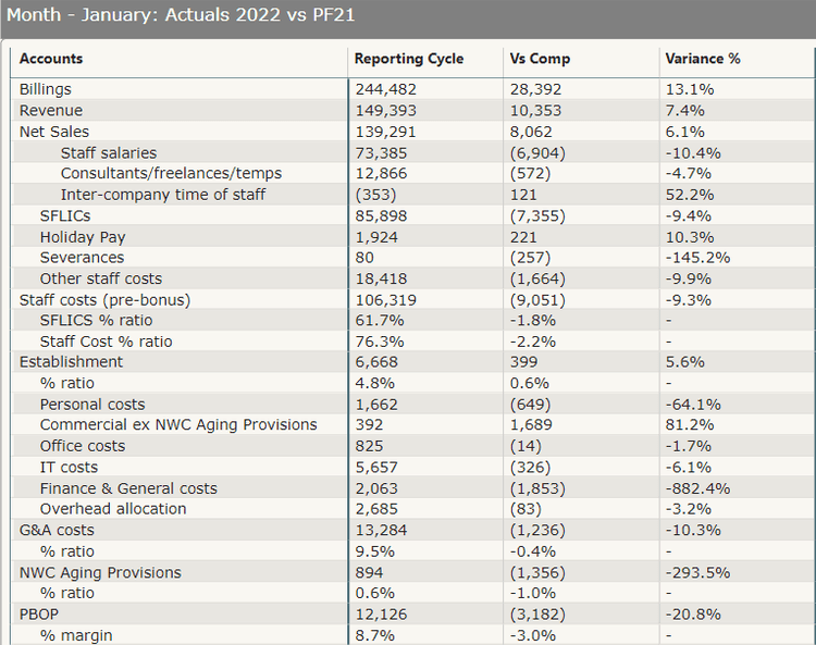
A variance matrix comparing actual account balances against a comparison period, with a variance percentage column.
Build the waterfall chart
A waterfall chart shows how a starting value moves through a series of increases and decreases to a final value, which fits an income statement bridge from revenue down to net income. Add a Waterfall chart visual, then set its three field wells:
Category. The account group column, such as
AccountGroup(Revenue, COGS, Opex, Net Income), ordered by the SortOrder column set up in the modeling step.Breakdown. Optional. Add a dimension such as Cost Center or Department here to split each category's bar into its contributing segments, and use the Maximum breakdowns setting in Format your visual > Breakdown to limit how many segments show before the rest collapse into an "Other" bucket.
Y-axis. A signed measure, since a waterfall chart needs increases and decreases to carry the correct sign to move the running total the right direction.
Net Movement =
VAR AccountType = SELECTEDVALUE('Chart of Accounts'[AccountType])
VAR RawAmount = SUM('General Ledger'[Amount])
RETURN
SWITCH(
    TRUE(),
    AccountType = "Revenue", RawAmount,
    AccountType IN {"COGS", "Opex"}, -RawAmount,
    RawAmount
)
This measure assumes revenue and cost accounts are both stored as positive amounts in the general ledger, so costs need a negative sign to subtract correctly on the chart. Check your own export's sign convention before using it, the same caution covered in financial analysis and reporting.
In Format your visual, you can set separate colors for increase, decrease, and total columns, and mark a specific category value, such as Net Income, as a total column so it renders as a solid bar from the axis rather than a floating one.
Share the report through a workspace
Select Publish on the Home ribbon in Power BI Desktop, sign in if prompted, and choose the destination workspace. A workspace is where the report and its semantic model live in the Power BI service, and where you control who can see or change it.
Workspace roles are Admin, Member, Contributor, and Viewer, and they apply per workspace, not per report. Give finance team members who build or maintain the report Member or Contributor, and give report consumers Viewer. A reader with a free Power BI license can only open content that sits in a workspace on an F64-or-larger Fabric capacity, or on a legacy Premium P capacity; without that, they need a Power BI Pro or Premium Per User license of their own. For the full breakdown of what each role can do, see our guide to workspace access roles. For setting up the workspace itself, see our guide to workspaces and apps.
FAQs
Can Power BI be used for financial reporting?
Yes. Power BI connects directly to general ledger data, models it around a chart of accounts, and includes native visuals such as the waterfall chart that are built for this kind of reporting.
Can I create financial statements in Power BI?
Yes. An income statement, a balance sheet, and a cash flow statement can each be built as a report page on the same general ledger model, using a matrix for the account hierarchy and a waterfall chart for the movement between opening and closing balances. See accounting reports: definitions and types for what belongs on each statement.
Sources
Waterfall Charts in Power BI - Microsoft Learn
Quickstart: Connect to data in Power BI Desktop - Microsoft Learn
Create and manage relationships in Power BI Desktop - Microsoft Learn
You build a financial report in Power BI in four stages, then share it. Connect to your general ledger and any supporting finance sources, shape that data in Power Query, model it around a chart of accounts, then build visuals on top of it, typically a variance matrix and a waterfall chart. Once it's built, you share it through a workspace. The steps below cover each stage, plus that sharing step. For what the different report types mean, see accounting reports: definitions and types. For the KPIs a financial report tracks and their DAX, see financial analysis and reporting.
Connect to your data sources
On the Home ribbon in Power BI Desktop, select Get data, then choose a connector. A financial report usually pulls from one of these:
An accounting system export or a general ledger extract, often as an Excel workbook or a flat file, if your finance system does not have a live connector.
A SQL Server or cloud database holding the general ledger tables directly, if finance runs on an ERP with a queryable backend.
Dataverse or another cloud service connector, if the general ledger sits in a platform Power BI connects to natively.
For most general ledger volumes, use Import mode rather than DirectQuery. Import loads a compressed copy of the data into the model, which is what makes the DAX measures in the modeling step below fast, and a nightly or twice-daily refresh is normally fine for a finance report that closes monthly or quarterly.
Shape and transform the data in Power Query
Select Transform data to open Power Query Editor before loading anything into the model. General ledger exports are rarely clean enough to model directly. Common transforms for this data:
Unpivot columns. Many GL exports put each period in its own column (Jan, Feb, Mar...). Unpivot turns those into a Date column and an Amount column, which is the shape a fact table needs.
Merge queries. Join the ledger extract to a chart of accounts file if account names and groupings live in a separate file.
Append queries. Combine multiple monthly or yearly extract files into one table before it reaches the model.
Filter rows. Remove unposted, zero-value, or non-financial rows that would otherwise inflate row counts without adding information.
Change type and rename columns. Set the Amount column to a fixed decimal number, not text, and set the Date column to a proper date type so the model's date table can relate to it.
Build the model
Build the model around the chart of accounts, the same shape described in financial analysis and reporting: a General Ledger fact table plus Chart of Accounts, Cost Center, and Date dimension tables. On the Modeling tab, select Manage relationships, then Autodetect to let Power BI find matching key columns, or New to build a relationship by hand between two specific columns.
Two things worth checking once the relationships exist:
Cardinality. A dimension table like Chart of Accounts should be the "one" side of a one-to-many relationship into the General Ledger fact table. Our guide to relationships and cardinality covers how to confirm this and what breaks when it is set the other way around.
Sort order. If a visual needs the accounts or account groups to appear in a specific order (Revenue before COGS before Opex, for example), add a numeric SortOrder column to the Chart of Accounts table and set the AccountGroup column to sort by it, rather than relying on alphabetical order.
For general modeling guidance beyond relationships, see our data modeling best practices. For the Power Query techniques above in more depth, see our Power Query guide.
Build the variance table
A variance report needs both an actual and a comparison value for each account, usually actual against budget. If your general ledger fact table does not already separate these, add a Scenario column to it (values such as Actual and Budget), so the same table holds both the real postings and the budget load, filtered by that column.
Actual Amount =
CALCULATE(
    SUM('General Ledger'[Amount]),
    'General Ledger'[Scenario] = "Actual"
)
Budget Amount =
CALCULATE(
SUM('General Ledger'[Amount]),
'General Ledger'[Scenario] = "Budget"
)Variance =
[Actual Amount] - [Budget Amount]Variance % =
DIVIDE([Variance], [Budget Amount])Add a Matrix visual, put AccountName on rows, and add Actual Amount, Budget Amount, and Variance % as values. Then select the Variance % column in the matrix, open Format your visual > Cell elements, and add a color scale or icon rule, such as red below zero and green above zero, so a reader can scan the column instead of reading every number.
A variance matrix comparing actual account balances against a comparison period, with a variance percentage column.
Build the waterfall chart
A waterfall chart shows how a starting value moves through a series of increases and decreases to a final value, which fits an income statement bridge from revenue down to net income. Add a Waterfall chart visual, then set its three field wells:
Category. The account group column, such as
AccountGroup(Revenue, COGS, Opex, Net Income), ordered by the SortOrder column set up in the modeling step.Breakdown. Optional. Add a dimension such as Cost Center or Department here to split each category's bar into its contributing segments, and use the Maximum breakdowns setting in Format your visual > Breakdown to limit how many segments show before the rest collapse into an "Other" bucket.
Y-axis. A signed measure, since a waterfall chart needs increases and decreases to carry the correct sign to move the running total the right direction.
Net Movement =
VAR AccountType = SELECTEDVALUE('Chart of Accounts'[AccountType])
VAR RawAmount = SUM('General Ledger'[Amount])
RETURN
SWITCH(
    TRUE(),
    AccountType = "Revenue", RawAmount,
    AccountType IN {"COGS", "Opex"}, -RawAmount,
    RawAmount
)
This measure assumes revenue and cost accounts are both stored as positive amounts in the general ledger, so costs need a negative sign to subtract correctly on the chart. Check your own export's sign convention before using it, the same caution covered in financial analysis and reporting.
In Format your visual, you can set separate colors for increase, decrease, and total columns, and mark a specific category value, such as Net Income, as a total column so it renders as a solid bar from the axis rather than a floating one.
Share the report through a workspace
Select Publish on the Home ribbon in Power BI Desktop, sign in if prompted, and choose the destination workspace. A workspace is where the report and its semantic model live in the Power BI service, and where you control who can see or change it.
Workspace roles are Admin, Member, Contributor, and Viewer, and they apply per workspace, not per report. Give finance team members who build or maintain the report Member or Contributor, and give report consumers Viewer. A reader with a free Power BI license can only open content that sits in a workspace on an F64-or-larger Fabric capacity, or on a legacy Premium P capacity; without that, they need a Power BI Pro or Premium Per User license of their own. For the full breakdown of what each role can do, see our guide to workspace access roles. For setting up the workspace itself, see our guide to workspaces and apps.
FAQs
Can Power BI be used for financial reporting?
Yes. Power BI connects directly to general ledger data, models it around a chart of accounts, and includes native visuals such as the waterfall chart that are built for this kind of reporting.
Can I create financial statements in Power BI?
Yes. An income statement, a balance sheet, and a cash flow statement can each be built as a report page on the same general ledger model, using a matrix for the account hierarchy and a waterfall chart for the movement between opening and closing balances. See accounting reports: definitions and types for what belongs on each statement.
Sources
Waterfall Charts in Power BI - Microsoft Learn
Quickstart: Connect to data in Power BI Desktop - Microsoft Learn
Create and manage relationships in Power BI Desktop - Microsoft Learn
Show us your report nobody trusts.
1 · A 30-minute call.
2 · We look at your current reports together.
3 · We tell you what we would do.
Show us your report nobody trusts.
1 · A 30-minute call.
2 · We look at your current reports together.
3 · We tell you what we would do.
Show us your report nobody trusts.
1 · A 30-minute call.
2 · We look at your current reports together.
3 · We tell you what we would do.

CaseWhen is a Berlin BI consultancy that builds reporting that leaders can trust, on the Microsoft stack: Power BI, Fabric and Azure.
Berlin, Germany
Free tools
CaseWhen is a Berlin BI consultancy that builds reporting that leaders can trust, on the Microsoft stack: Power BI, Fabric and Azure.
Berlin, Germany
Free tools
CaseWhen is a Berlin BI consultancy that builds reporting that leaders can trust, on the Microsoft stack: Power BI, Fabric and Azure.
Berlin, Germany