Business Intelligence
Written By: Sajagan Thirugnanam and Austin Levine
Last Updated on October 29, 2024
A well-designed sales dashboard is an essential tool for any business aiming to make data-driven decisions. Over the years, companies have become more and more data driven which means sales reports in excel files are a thing of the past.
A sales dashboard provides a consolidated view of sales data, enabling stakeholders to track performance, identify trends, and make informed strategic choices. In this blog, we will walk you through the steps to create a sales dashboard that enhances decision-making.
What Is A Sales Dashboard?

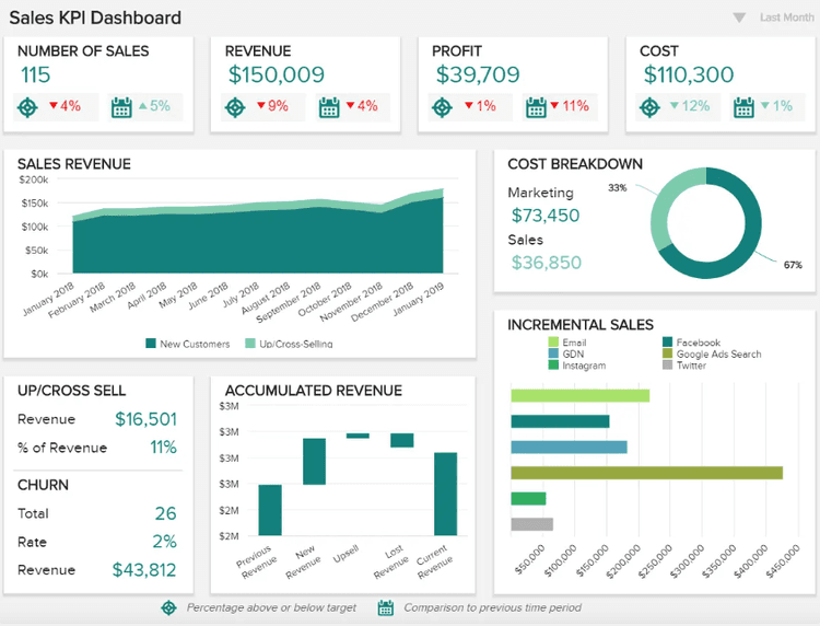
An intuitive sales dashboard, like the one above, is an ideal tool for monitoring and optimizing sales performance. Featuring powerful high-level metrics, this type of report is especially valuable for sales managers, account managers, and sales executives as it provides crucial data for ensuring strategic and operational success.
A sales dashboard generally focuses on a few key metrics which are vital to any sales team. These include:
Total Sales Revenue: The total income from sales.
Sales Growth: The percentage increase in sales over a period.
Average Order Value (AOV): The average amount spent per order.
Sales by Region/Product: Breakdown of sales by geographical area or product line.
Customer Acquisition Cost (CAC): The cost of acquiring a new customer.
Customer Lifetime Value (CLV): The total revenue expected from a customer over their lifetime.
Knowing the historical trends of these key metrics is vital as it helps the sales team predict the future in terms of potential spikes in the season and plan accordingly.
Choose The Right Visualization Tools
Select a tool that suits your needs and technical expertise. Popular tools include:
Power BI: Great for robust, interactive dashboards with powerful data modeling capabilities.
Tableau: Excellent for advanced visualizations and detailed analytics.
Google Data Studio: Good for simple, shareable dashboards.
Power BI is a great all round tool to use for such reports as it has a good blend of custom visuals, data modeling capabilities and affordability. To learn more about Power BI, visit the CaseWhen Blog.
Designing A Sales Dashboard
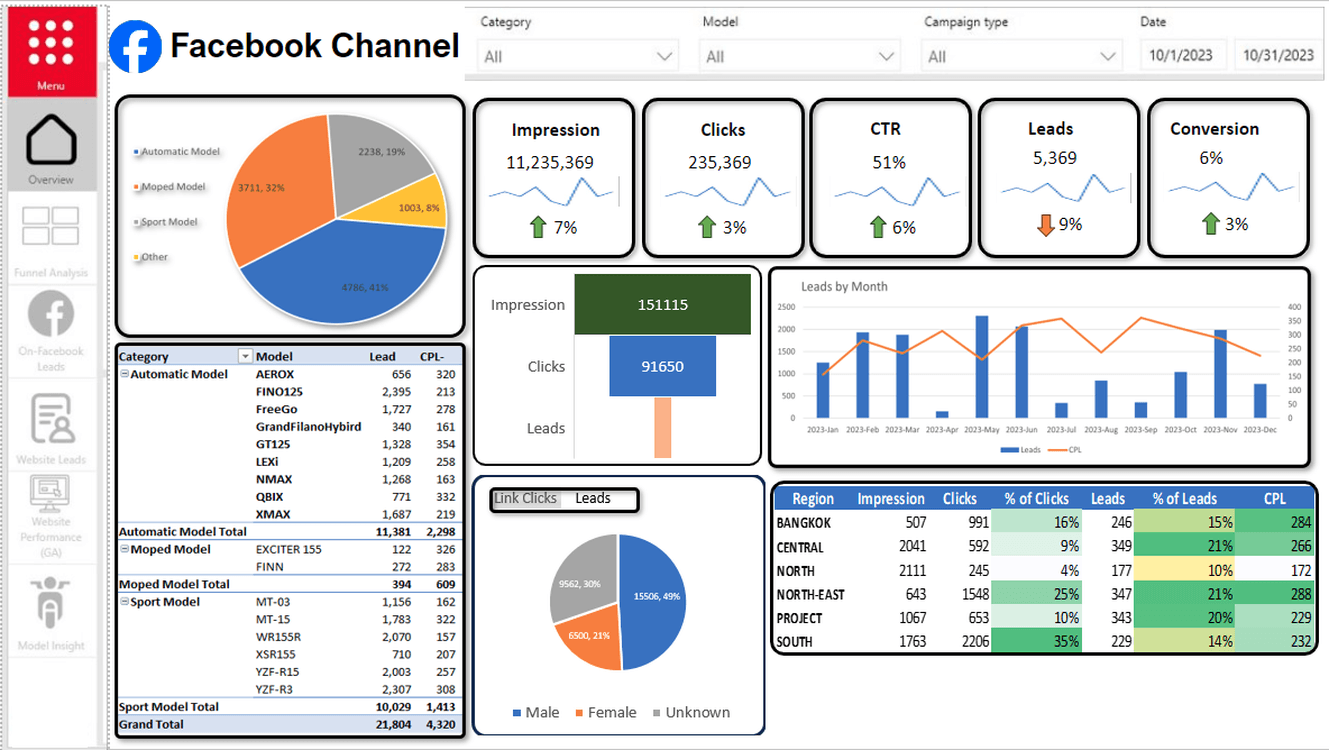
The next step is to design the dashboard that has a good blend of interactive visuals, proper design elements and planning. This allows for the dashboard to be more intuitive and helps in swift decision making.
Oftentimes we create a dashboard by putting random charts and visuals all over the place. However, ideally we want to plan this in advance so we can ensure optimal results once the dashboard is rolled out to the users.
To achieve this, keep in mind the following tips!
Know your audience
Creating a dashboard is a storytelling process that involves knowing your audience and how they will use this information. Given the sales dashboard will ultimately be used by the sales team, it might be a good idea to sit with the team and discuss the goals of the dashboard. Take feedback from the team as to what elements they expect to be in the dashboard and in this way the team will also feel more connected with the dashboard.
In short, knowing the audience allows us to cater to the specific need of the user and eventually drives engagement with the dashboard in the long run.
Create a dashboard wireframe
Once we have figured out what the team expects out of the dashboard, it’s always a good idea to put down the ideas in a wireframe format. A wireframe is essentially a blueprint of the dashboard which serves as a guide for the layout and functionality of the final dashboard.

Above is an example of how a wireframe might look like. The wireframe typically includes:
Basic layout of each tab - specify each visualization (e.g., bar chart, line chart, pie chart) and ensure we pick the right type of chart for the data type
Indicate how different components will interact (e.g., clicking a filter to update a chart)
Add notes or annotations to describe functionality and data sources
Choose the right types of charts
What do I mean by choosing the right types of charts?
Take this for instance: a time series trend data is usually best represented using a line chart whereas a pie chart is used to show the split of something, for example, the split of customers by their location. Hence it is very important to choose the right charts depending on the type of dataset we are working with. Sales data usually involves historical trend data which means line and bar charts are very popular.
This aspect should be solved while creating the wireframe as you will already decide on which charts to pick for the different visuals. The feedback from the sales team is also very important here as they might have a say on things here.
Implement Interactivity
Enhance your dashboard with interactive elements:
Drill through: Allow users to drill through on a data point to see more detailed information. To learn how to implement drill through, visit the CaseWhen Blog.
Tooltips: Provide additional context when users hover over data points.
Automated Updates: Ensure the dashboard updates in real-time or at regular intervals to reflect the latest data.
These features add to the overall dashboard experience and can help your team make quick strategic decisions!
Tips for Effective Dashboards
Keep It Simple: Avoid clutter by focusing on key metrics and using clear visuals.
Be Consistent: Use consistent formats, colors, and layouts to improve readability.
Tell a Story: Arrange data in a way that guides the user through insights and actions.
Test and Iterate: Continuously test the dashboard with end-users and refine based on feedback.
Ready To Start Creating Your First Sales Dashboard?
Creating an effective sales dashboard involves understanding key metrics, preparing accurate data, selecting the right tools, and designing with the end-user in mind. By following these steps, you can build a dashboard that provides valuable insights and supports strategic decision-making, ultimately driving business success.
I hope this helps you understand how to create a sales dashboard for best decision making in your business. To learn more about dashboards and its examples, visit this blog!
FAQs
What are the essential elements of a good dashboard?
A good dashboard includes key performance indicators (KPIs), clear and concise data visualizations, real-time data updates, interactive elements (such as filters and drill-downs), and a user-friendly design. It should provide relevant context and be tailored to the specific needs of its users.
What is sales analytics?
Sales analytics enable you to predict future success and identify the most effective strategies for your sales efforts with the use of different analytics tools such as Google Analytics, Power BI etc.
What are dashboard design templates?
Dashboard design templates are pre-designed layouts that provide a user interface for creating data reports and create dashboards faster with proper designing. These templates provide a starting point for building dashboards, helping BI developers and analysts to quickly build visually appealing dashboards without having to start from scratch.
Related to Business Intelligence