Business Intelligence
Written By: Sajagan Thirugnanam and Austin Levine
Last Updated on October 7, 2024
In most successful organizations, you’ll often find that leaders are leveraging the power of dashboards to support strategic decision-making. Different types of dashboards can be created for employees of all levels to consume, which ultimately can impact every area of the business. When implemented correctly, they are capable of positively transforming how an organization operates.
Dashboards are created for different purposes, can service different audiences, and can also come in different formats. To clear this up, we’ll uncover more details about creating and implementing different types of dashboards in your organization.
What Is The Purpose Of A Dashboard?
Dashboards allow teams to achieve better Business Intelligence, known as the ability to synthesize data across various platforms and construct a narrative behind events in their business. Popular dashboarding tools like Tableau, Power BI and Looker also solve for reporting scalability issues; facilitating dynamic connections to large datasets, and updating metrics autonomously.
With a well-constructed dashboard, leaders may review them on a daily, weekly, or monthly cadence to understand how a team is meeting or exceeding a set of business goals. They allow these individuals to clearly identify strengths and weaknesses in the current state of the business, supported by real-time, or near real-time data. This ultimately facilitates meaningful dialogue between leaders and other members of the organization to help move closer to a goal.
It’s also important to note that dashboards aren’t just for top decision-makers to consume. Other business users, like operational coordinators, can find great value in a dashboard in helping them understand how their work is impacting a particular area of the business.
What Makes A Good Dashboard For A Business?
The best type of dashboard is one that is intuitive to use and paints a clear picture of a handful of well-defined questions. It demonstrates both the art of thoughtful data visualization design and the science of calculating business metrics in an accurate way. This is done by being developed for a specific target audience of business users to facilitate a decision-making process.
It’s also important that dashboards display the correct granularity of the business question they are designed to answer. It can be easy for new analysts to create dashboards with too much “noise”, or non-impactful visualizations for the target audience.
For example, a supply chain team might need to implement a dashboard that helps them understand turnaround times from the moment an order is placed to when the product gets delivered to a customer. The fulfillment process may be complex with various decision trees for each product type, but a good dashboard is able to abstract any unneeded complexities. In this case, it might ultimately tell the end user which parts of a shipping process are taking the most time to complete and the reasons why.
What Types Of Dashboards Exist?
Businesses can virtually implement an infinite number of dashboards (although never advised), all with varying purposes. However, dashboards are typically classified into four different categories-
Strategic Dashboard
Monitors a long-term objective for an organization, and how they are performing against benchmarks.
Tactical Dashboard
These are project-specific dashboards that relate to the objectives of a department or specific initiative. It can be a subset of a longer-term objective.
Operational Dashboard
Allows organizations to monitor operational KPIs, usually at a current point in time. These are typically developed to help teams to improve internal processes.
Analytical Dashboard
Utilizes large-scale historical datasets to uncover trends or patterns about a particular area of the business.
Let’s cover each of these in more depth:
Strategic Dashboard
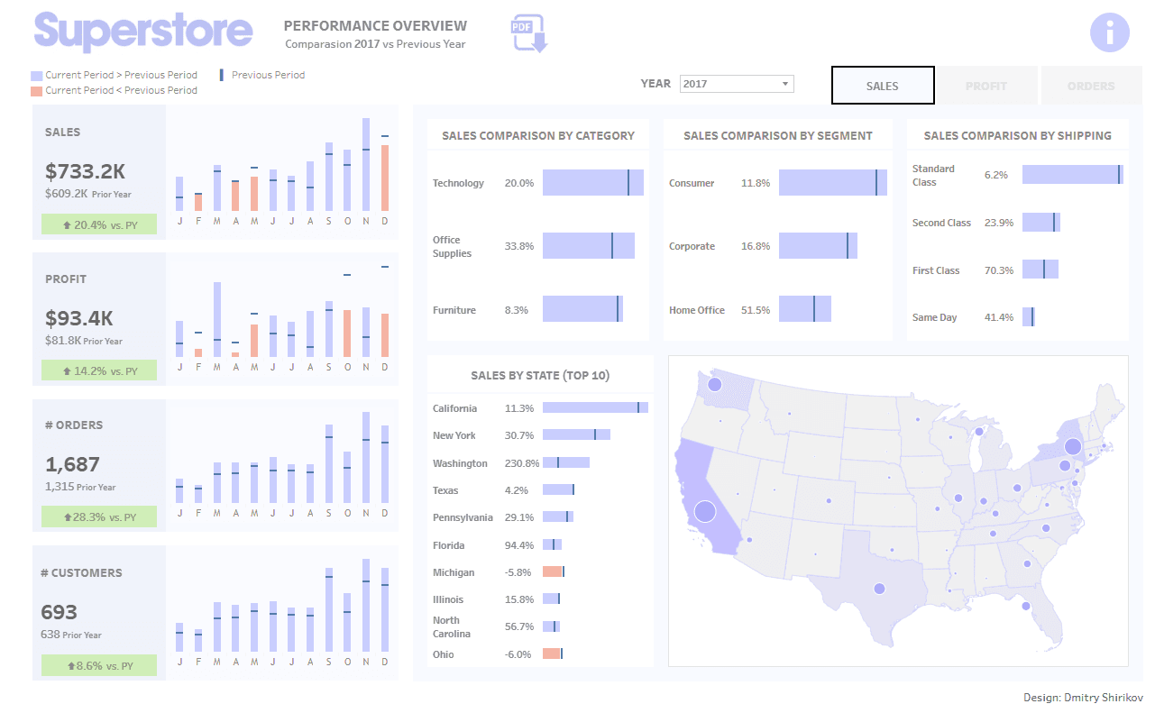
A Strategic dashboard monitors high-level KPIs for the business, allowing leaders to understand how an organization is aligning with large-scale goals. This is the type of dashboard best suited for CEO’s and other Senior-level managers. It allows leaders to identify what areas of the business are performing strongly vs. which ones need attention. To better understand this type of dashboard, let’s look at one example:

The above Superstore Performance Overview Dashboard (by Dmitry Shirikov on Tableau Public) is a great example of a Strategic dashboard for a big box retail store like Target or Walmart. Best suited for a senior leader in Finance, Sales, or Operations, it allows the end user to understand how their organization is achieving their Sales and Profit objectives. It also segments this summary by important dimensions such as product category and territory. If the “Superstore” organization were to have an annual goal of increasing their profit by 10% YoY (a long-term objective), this dashboard answers that question and gives context as to the main drivers.
Tactical Dashboard
A Tactical dashboard is usually best suited for department heads or middle managers, telling a story about a particular project. While this is similar to a Strategic dashboard, Tactical dashboards are usually a subset of a long-term organizational strategy that require more nuanced detail.
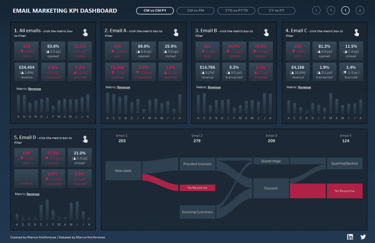
The Email Marketing KPI Dashboard (by Marius Nikiforovas on Tableau Public), is an example of such a dashboard. Here, the author shows detailed metrics about an email campaign outcome, citing domain specific KPIs such as Click Through Rate, Open Rate, Bounce Rate, and total amount of conversions.

In a business that sells digital products and is promoting them through an email campaign, an analytics team might set up two dashboards-
A Strategic dashboard to understand how their overall products are selling in accordance with annual revenue goals
A Tactical dashboard like the one shown above to show additional context as to how leaders might anticipate to see new sales against those products.
This way, different leaders are presented with the correct amount of granularity that is relevant to their business needs.
Operational Dashboard
An Operational dashboard allows middle managers and lower level employees to understand trends behind near real-time data in how they relate to a particular business process. By having a set of workflow related KPI’s, teams are able to understand inefficiencies in a process and prioritize their day better.
These types of dashboards also connect teams who might lack domain context about a specific area of the business. This way, team members can have a better dialogue on how to troubleshoot system issues, answer to clients, or improve an overall process.
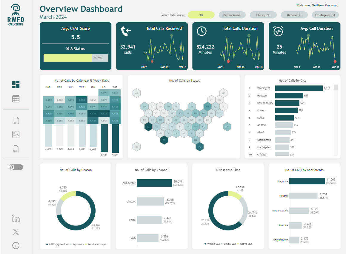
The Call Center Dashboard (by Waqar Ahmed Shaikh on Tableau Public) is a great example of an Operational dashboard. It displays both high-level and granular metrics on the outcomes of a call center by citing trends on call frequency.

A call center dashboard like this might not only benefit a Customer Success team who is facilitating and logging the work, but it might also positively impact a Sales team. Suppose a customer complains that they have difficulty contacting support at a certain hour of the day. With a dashboard like this, a sales member can see that the team receives the largest amount of calls on Friday and Saturday, so they can use this knowledge to explain to clients why they might be experiencing longer waiting times.
Additionally, this benefits members of a customer success team by identifying where the majority of their calls are coming from. In this case, Washington DC is the city with the largest call volume, so its worth noting that there may be additional challenges that the business is facing in a particular geographic region.
Analytical Dashboard
Often the most complex, Analytical Dashboards offer a rich history of time series data to uncover trends about a business that would not be otherwise known. The key between differentiating an Analytical dashboard over the other dashboards mentioned above is that Analytical Dashboards prioritize the presentation of trends over just KPIs – think “Rate of Customer Churn” in Sales or “Rate of Return” in Finance. These types of dashboards often serve as the intersection between Business Intelligence and more advanced Data Science concepts like predictive modeling.
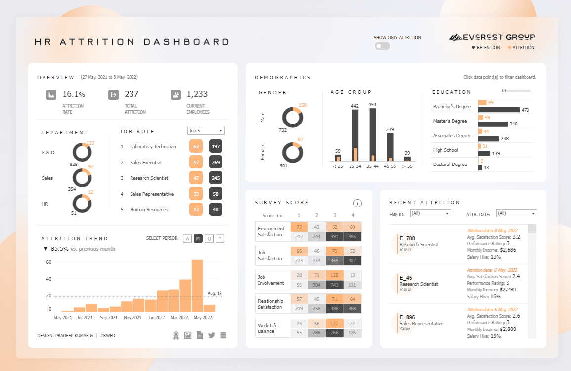
The HR Attrition Dashboard (By Pradeep Kumar G on Tableau Public) can be considered an example of an analytical dashboard as shown below:

In this example, the author identifies trends from an HR dataset on employee churn within a company. What makes this particularly useful as an Analytical dashboard, is it’s time series “Attrition Trend” visual on the bottom left of the page. This shows the user that employee churn is increasing, most of which being Sales Representatives, Lab Technicians, or Research Scientists in April of 2022. It also presents to us an overall attrition rate of 16.1%, giving us better insights as to the severity of employee retention.
After consuming this information, we can conclude that there may have been a workplace event in April that sparked the sharp increase in employee attrition. HR leaders can take this information back to department heads and construct a more detailed narrative as to why it happened, giving them the ability to mitigate this in the future.
What is the right dashboard for your business needs?
It’s important to note that while there are commonly known types of dashboards that most businesses use, it doesn’t mean that you need to follow those exact design guidelines to achieve the best outcome. This is because with any organization, there is no one-size-fits-all approach to presenting data, since all businesses come with their own unique set of nuances.
For this reason, it’s best to understand the biggest challenges your organization is facing and formulate those into business requirements. Once you have defined this thoroughly, understand what team members within your organization are best suited to consume this data to make your dashboard design as relevant as possible.
With a business-first approach to design, you are set up for success to drive positive outcomes for any type of dashboard!
Related to Business Intelligence