Dashboard Design
Written By: Sajagan Thirugnanam and Austin Levine
Last Updated on October 7, 2024
Creating a dashboard from scratch is not only a technical challenge but also a creative journey. Dashboards are ultimately a medium to solve business problems, hence, ensuring the dashboard serves this purpose means we have to design and create dashboards keeping the business requirement in mind.
This creative part is actually a fundamental challenge when creating any dashboard and mastering this has helped me create numerous business oriented dashboards that has helped advance my career as a Data Analyst.
And here is how you can master the art of dashboard creation as well!
Whether you are new to this field or a seasoned campaigner, I hope you will get an in-depth prescription on how to build dashboards that can lead to better decision making from this post.
Know Your Target Audience and Dashboard Objective
Creating a dashboard is a storytelling process that involves knowing your audience and the objective of the dashboard.
Before we build a dashboard, we should always consider the following:
Who are we creating the dashboard for?
What business problem will the dashboard address?
Who Are We Creating The Dashboard For?
Have you ever worked with top level executives in a corporate setting?
If so, you must have noticed that C-level executives have a tendency to work with topline numbers and metrics. This is not because they don’t understand more granular metrics but has to do everything to do with how they manage their time efficiently.
Consider this:
You are making a dashboard for the Chief Executives of the company. The CEO does not need to know which account manager has brought in the most amount of revenue in the past quarter. To them what is most important is an overview of the organization’s overall performance in terms of revenue, profitability, market share and other such critical insights at a glance.
Conversely, a dashboard created for the Customer Success team will focus more on customer-centric data points including NPS, customer retention and cohorting based on customer interaction with the products.
You might be wondering:
How do we determine who the end user will be when we are in the initial planning phases?
It’s simple!
If we do not know from the task brief, we have to ask. One of the biggest mistakes one can make while building a dashboard is starting work before we have all our questions answered. This may result in vital hours being spent inefficiently, or worse - for the wrong reason altogether.
What Business Problem Will The Dashboard Address?

Source: eleken.co
Knowing the business problem that the dashboard will solve is crucial before creating a dashboard.
Is the dashboard to be used for business monitoring purposes solely or will the sales team extract data from the dashboard to create weekly reports for their internal KPI tracking?
Here’s the deal:
If the end user needs raw level insights then it might be a good idea to use features such as drill down in Power BI to allow users to go deep into the data and extract and manipulate the raw data. Or we can create simple tabular charts to let the users view and extract the data in Excel format.
This all might seem overwhelming to someone who is new to the dashboard creation process. All this before we even start building the dashboard!
However, want to know the best part?
Answering these two simple questions lets you solve half the complexities of creating a dashboard that can enable better decision making.
What follows becomes much easier once we know the target group of this dashboard and the business purpose behind building the dashboard!
Create a Dashboard Wireframe To Gain Clarity in Dashboard Design
Creating a dashboard involves designing as much as it involves technical aspects. The best way to ensure we create a dashboard design which matches the expectation of the end user is by creating a wireframe. A wireframe is a blueprint of the dashboard which serves as a guide for the layout and functionality of the final dashboard.
These are some vital things to include in the wireframe:
Define KPIs and metrics which align with the business requirement
Basic layout of each tab - specify each visualization (e.g., bar chart, line chart, pie chart) and ensure we pick the right type of chart for the data type
Indicate how different components will interact (e.g., clicking a filter to update a chart)
Add notes or annotations to describe functionality and data sources
A Wireframe Example
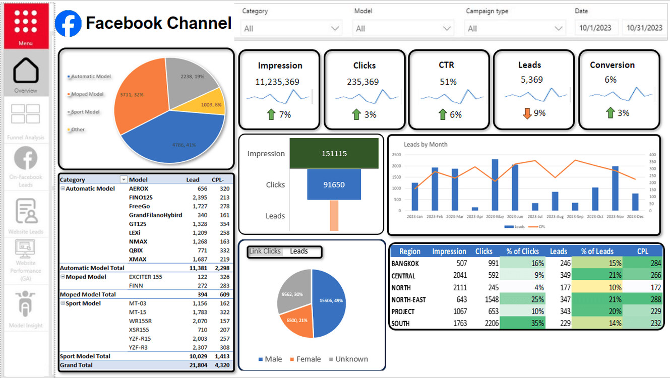
This wireframe may not necessarily look amazing but it gets the job done! It shows exactly what type of charts we will use for each data point and the final look and feel of the tab for Facebook Channel.
And here’s the deal:
This gives the end user a clear cut knowledge of how the final output may look like and enables them to provide feedback to move things around where necessary before any actual development happens
To create a wireframe, we can pick tools such as Balsamiq, Sketch, Figma, Adobe XD, or even PowerPoint.
Give Context To The Dashboard
Imagine your dashboard says that your company has acquired 1534 new customers to the platform last quarter. When someone looks at this number, they might think this is a positive sign for the company. However, if we provide some context to the number we will see that in the previous quarter we actually had 2235 new customers on board onto the platform indicating a 31% drop in customer acquisition.
This is why context is important!
Source: datapipeline.com
By giving context, users can understand that something is not working out right for the platform and needs to be looked into.
Create Interactive Dashboards To Improve User Experience
While creating a dashboard we can allow users to interact with the dashboard to help with data manipulation and data exploration. Interaction lets us drill down into the data to get raw level data if required and cross filter with different charts.
This is a powerful way to use the dashboard as this simplifies the analysis process and makes the dashboard more user-friendly while providing answers to key business questions immediately.
If the dashboard you create is interactive, you have the flexibility to keep the data simple yet more powerful than a mere static dashboard.
This is a great way to make your dashboard more advanced and gives you brownie points for taking the extra step to make the lives of everyone much easier!
Examples of Different Types of Dashboards
Now that we have explored the essential elements of building a new dashboard, let’s take a look at some examples for different dashboard use cases:
Customer Service Dashboard
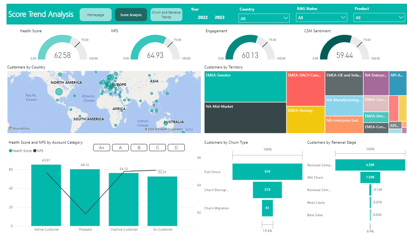
Creating a customer service dashboard means you need to consider that it meets the needs of the team and effectively tracks the KPIs and metrics which are most important to the CX department.
These are some key metrics which are often common to a Customer Service Dashboard:
Metrics such as health score, NPS, engagement rate etc
Ticket volume and resolution time
Agent level information
Churn and Renewal Rates
These are just some top level data points which can be very crucial to a Customer Service dashboard. However, the full length of visualizations to be used in such a dashboard would vary based on some of the things we discussed previously in this blog such as target audience, business requirement etc.
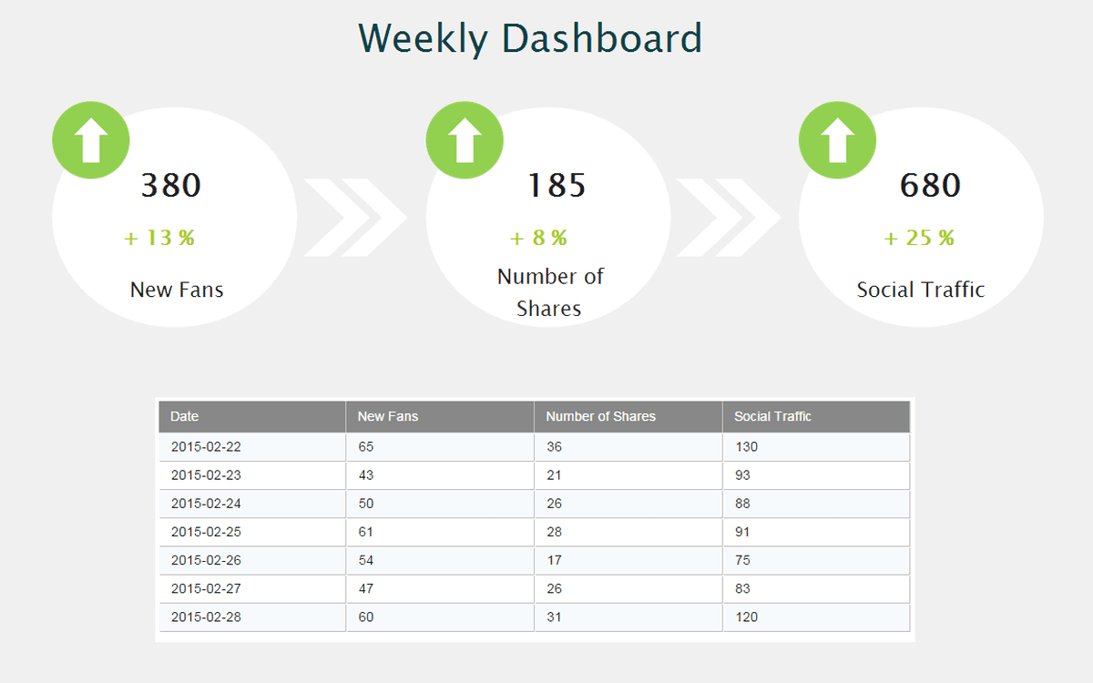
Campaign Monitoring Dashboard
Here is a snapshot of a campaign monitoring dashboard.
This allows us to track the performance and effectiveness of marketing campaigns. Here are the key features which are required for such campaign monitoring dashboards:
Conversion Rates
Click Through Rates
Engagement Metrics
KPI Benchmarks
A/B Testing results
Integrating these key KPIs and metrics help make the campaign monitoring process much simpler for the campaign manager and team!
Management KPI Dashboard
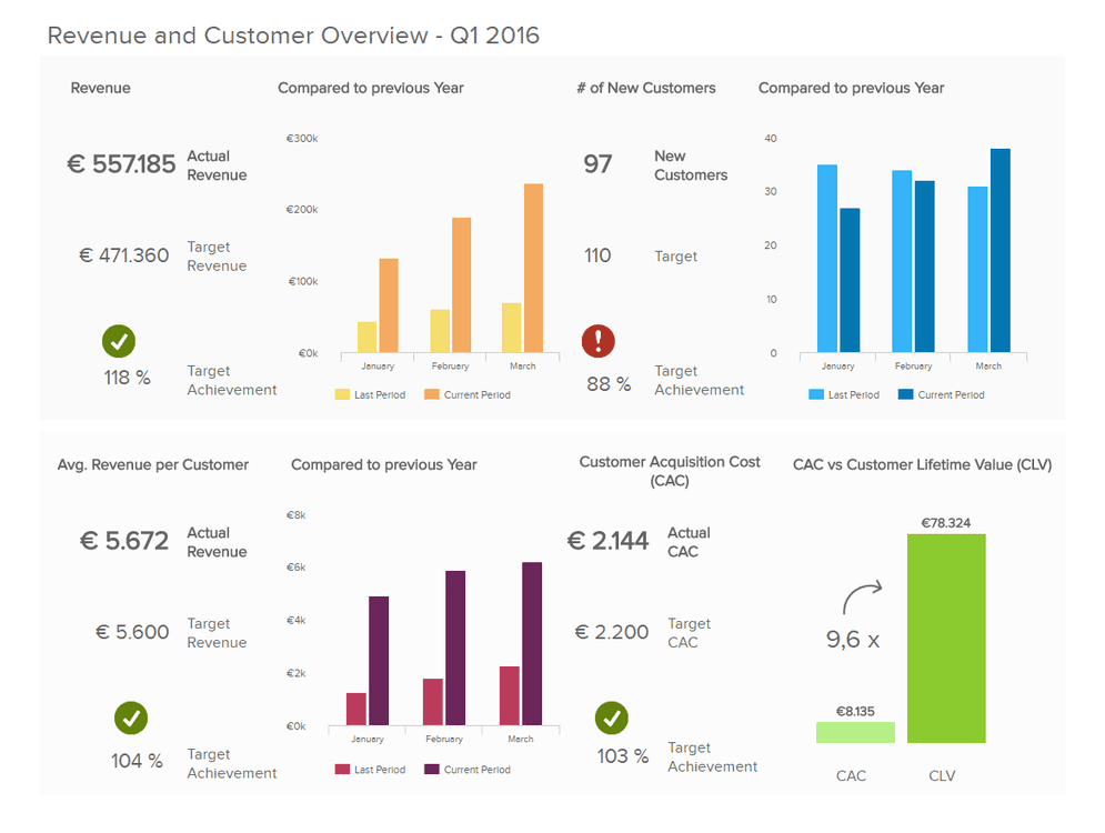
Source: datapipeline.com
These types of dashboards are for the top level executives of a company. The people who run the business and just want top line numbers such as:
Target vs Actual Revenue
Customer Acquisition in platform
Revenue per Customer
Customer Lifetime Value (CLV)
Comparison to previous period
The chief executives make multiple business decisions daily and having the right intel in the right format can often be the difference between the outcome of a company and its future!
High stakes stuff, isn’t it?
For more such dashboard examples, you can read this blog.
Common Challenges & Mistakes of Creating A Dashboard
While creating a dashboard, we must keep in mind some basic guidelines to stay away from bad practices.
Overcrowding The Dashboard
One of the biggest mistakes young budding analysts make is overcrowding the dashboard with too much information. This can make it very difficult to extract anything meaningful from the dashboard. Our brains work best when we work in a clean, tidy setup. The same is applicable here.
So let’s try to keep it clean and concise!
No Alloted Time For Validation
Another thing to keep in mind is testing and bug fixes. Data is meaningless if it lacks accuracy. Moreover, oftentimes dashboards in Power BI can break in formatting when we publish the dashboard. These are all easy fixes only if we allot time for testing and bug fixes after we are done with the initial setup and creation of the dashboard.
Ignoring Mobile Design
With the advancement of smartphones in the last decade, it is now vital that we design our dashboard for mobile versions as well!
Ignoring this can limit the user accessibility of our dashboards and eventually may require double work when the requirement arises in the future. So let’s save time and design the dashboard for smartphone screens as well!
Final Thoughts
I hope this article helps list out the key steps involved in planning, designing and creating a dashboard from scratch. We have gone through the entire storytelling process from knowing our audience to understanding the business objectives to some sample dashboard examples. Hope this comes in handy when creating a new dashboard - whether it’s in Power BI, Tableau or some other visualization tool.
By following these essential tips, it should simplify the entire dashboarding process. Remember this: dashboarding is as much a creative process as it is a technical one.
Happy dashboarding!
FAQs
What are the essential elements of a good dashboard?
A good dashboard includes key performance indicators (KPIs), clear and concise data visualizations, real-time data updates, interactive elements (such as filters and drill-downs), and a user-friendly design. It should provide relevant context and be tailored to the specific needs of its users.
What are the 3 main purposes of a dashboard?
Dashboards are useful for monitoring, measuring, and analyzing relevant data in key areas. They take raw data from many sources and clearly present it in a way that's highly tailored to the viewer's needs.
How can I gather feedback to improve my dashboard?
Regularly request feedback from the dashboard’s users through surveys, interviews, or usability testing. Pay attention to their suggestions and pain points, and use this feedback to make iterative improvements to the dashboard.
Related to Dashboard Design