Power BI Tutorials
Written By: Sajagan Thirugnanam and Austin Levine
Last Updated on October 29, 2024
Maps are an amazing way to visualize geographical trends and variances across locations across the world and to facilitate this Power BI has a number of mapping visuals with advanced features. Maps offer you the ability to interpret geospatial data easily and drill down into region specific analysis.
This blog will walk you through the different mapping options in Power BI, the steps to create interactive maps and tips for optimizing them to enhance your reports.
Types of Maps In Power BI
There are several different map types in Power BI which we can make use of. Let us understand them in depth and the features each one brings to the table.
Basic Map
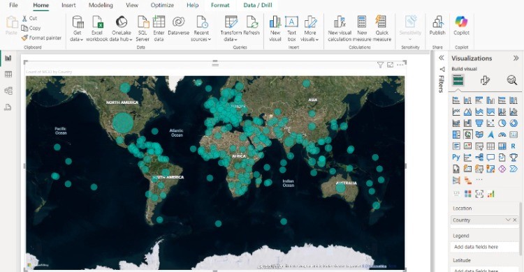
Basic Map Visualization is the simplest and most common map type in Power BI. It uses Bing Maps as the base layer and allows you to plot geographic data points (e.g., cities, countries, or specific locations) using latitude and longitude or place names.
This type of chart allows you to zoom in and out, drag across the map, and view multiple data points while having the ability to adjust the bubble size and colors. You can also tinker with map styles allowing for Aerial view or Road view.

Filled Map
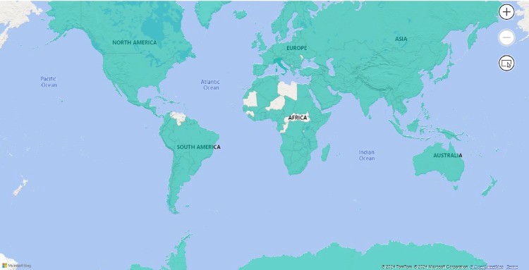
Filled Maps are ideal for visualizing data across geographic regions such as countries or cities. These maps color-fill regions based on the data values assigned to each area, making it easy to see how different regions compare

Shape Map
Shape Maps offer a different perspective on data visualization where you can customize shapes to display data for specific areas like sales territories or districts.
These maps are particularly well-suited for illustrating comparisons between different regions, offering a visually engaging and informative representation of your data.
Step-by-Step Guide to Creating Interactive Maps in Power BI
Step 1: Prepare Your Data for Mapping
Before creating maps in Power BI, ensure your dataset contains geographic data that can be used to plot locations. The key columns you might need include:
Place Names: City names, countries, states, or regions.
Geospatial Coordinates: Latitude and longitude values for specific locations.
Ensure the geographic data is clean and properly formatted, as incorrect place names or coordinates can result in inaccurate map visualizations.
Step 2: Adding a Basic Map Visualization
Launch Power BI Desktop and open your report.
Get Data: Import your data from a source (Excel, SQL, or any other supported platform).
Insert Map Visualization: From the Visualizations pane, select the Map icon.
Drag and Drop Data: Drag the geographic fields (e.g., city, country, or latitude/longitude) into the “Location” field well. Add relevant numeric data (e.g., sales or population) into the “Size” or “Values” field to display bubbles on the map.
Step 3: Customizing Map Elements
Once you’ve plotted your data on the map, you can enhance its appearance and functionality:
Adjust Bubble Size and Colors: Use conditional formatting to differentiate values using color scales.
Add Legends: If you want users to understand data categories visually, add a legend for clarity.
Tooltips: Customize the tooltips to show additional data when users hover over specific locations.
Labels: Enable data labels to display numeric values directly on the map.
Best Practices for Optimizing Performance with Power BI Maps
Ideally, to ensure the best performance in your report including maps, you would want to limit data points by using aggregations and filters on the data. Displaying thousands of data points on a map can slow down the overall performance of your report.
Moreover, it might be wise to use the drill-down feature for large datasets which allows users to explore data in smaller chunks rather than displaying everything at once.
In Closing
Maps are a great Power BI visualization tool that can make your dashboard and reports look splashier and grab the attention of your users. Understanding when to use which type of maps is very important as well.
I hope this article can make a difference and help you explore the different intricacies of maps in Power BI. By following the steps outlined in this guide, and using the tips and best practices shared, you’ll be able to create amazing interactive maps that enhance your Power BI reports and drive better decision-making in your organization.
FAQs
What data do I need to create a map in Power BI?
To create maps in Power BI, you need city/state or country data points. If not, you can also use Lat Long coordinates for more accurate mapping in Power BI. Postal codes or country codes are also supported.
What is the ArcGIS Map in Power BI and when should I use it?
ArcGIS Map provides advanced geographic features like adding demographic layers, satellite imagery, and heat maps. It is best used for detailed spatial analysis, such as environmental monitoring, urban planning, or risk assessment.
Related to Power BI Tutorials