Dashboard Design
Written By: Sajagan Thirugnanam and Austin Levine
Last Updated on July 14, 2026
Dashboarding is an essential skill set in the growing field of data. Being an expert at building dashboards is not only a technical skill but also a creative one. It’s one thing to learn how to import data, build a model and create complex visualizations. However, oftentimes we still don’t end up with a dashboard that we are satisfied with.
Have you ever felt this way? If so, this article is for you!
One of the main reasons for this is because we are not mindful of the dashboard design. Designing a great dashboard does not require you to be a designer. You can follow some tried and tested guidelines to achieve a design that leads to better user experience and decision making.
Here’s a step by step guide on how to build and design a great dashboard that clearly communicates your key goals and metrics. This can be a dashboard design checklist that will come in handy before you start building a new dashboard or want to revamp an existing dashboard!
Know Your Target Audience
Creating a dashboard is a storytelling process that involves knowing your audience and how they will use this information. Knowing this is crucial as it allows us to:
Tailor content for the specific requirement and audience
A user-centric design considers the technical proficiency of the audience, ensuring that the dashboard is easy to navigate and interact with, regardless of their technical skills
Focus on KPIs that will help them make informed strategic decisions
In short, knowing the audience allows us to cater to the specific need of the user and eventually drives engagement with the dashboard in the long run.
KPI Frameworks Are A Great To Identify Key Metrics
A KPI Framework is essentially a structured method to define, measure and manage key metrics that are critical for a business.
This is instrumental in creating an effective dashboard design as it helps with:
Clarity and focus by identifying key metrics and prioritizing which data to highlight
Alignment with business objective by ensuring KPI shown in dashboard is linked to the business objective
Improved data visualization as it helps in selection of appropriate visualization techniques (e.g., charts, graphs, tables) that best represent each KPI - this enhances readability and comprehension of the dashboard
Hence, it is highly recommended to first create a KPI Framework in the process of designing a great dashboard before we go on to the next step!
Create a Dashboard Wireframe To Gain Clarity in Dashboard Design
Once we have the KPI Framework finalized, we need to focus on creating a wireframe to ensure we create a dashboard design which matches the expectation of the end user. A wireframe is essentially a blueprint of the dashboard which serves as a guide for the layout and functionality of the final dashboard.
These are some vital things to include in the wireframe:
Basic layout of each tab - specify each visualization (e.g., bar chart, line chart, pie chart) and ensure we pick the right type of chart for the data type
Indicate how different components will interact (e.g., clicking a filter to update a chart)
Add notes or annotations to describe functionality and data sources
While creating a wireframe, we must consider what makes a dashboard design great!
Great dashboards are clear, intuitive and easily comprehensible!
They communicate information quickly
They display information clearly and efficiently
They show trends and changes in data over time
These allow users to customize the data as required using filters and slicers
Choose the right types of chart!
Choosing the right type of chart is very important to ensure that the design of the dashboard complements the data we are visualizing.

For instance, a time series trend data is usually best represented using a line chart whereas a pie chart is used to show the split of something, for example, the split of customers by their location.
Some of the most common types of charts are:
Comparison Charts such as bar chart, line chart etc
Composition Charts such as stacked area chart, pie chart
Distribution Charts such as histogram and scatter plot
Here is a tip for the next time you are building a dashboard:
Try experimenting with different visuals - be it built-in or custom visuals. Observe how changing the visual can impact the outcome of the insights and information you can gather from the same data. This is a great way to understand why choosing the right type of chart is so crucial while designing a dashboard.
Use a Color Theme
If you work for a company, they most likely have a color theme that they follow across the organization. While designing a dashboard, we must keep this color theme consistent to follow the brand’s identity. This includes the colors, fonts and graphics.
On top of this, it is also important to keep the dashboard theme consistent across different charts and tabs. Have you ever come across a dashboard that just looks too much for the eyes and brain?
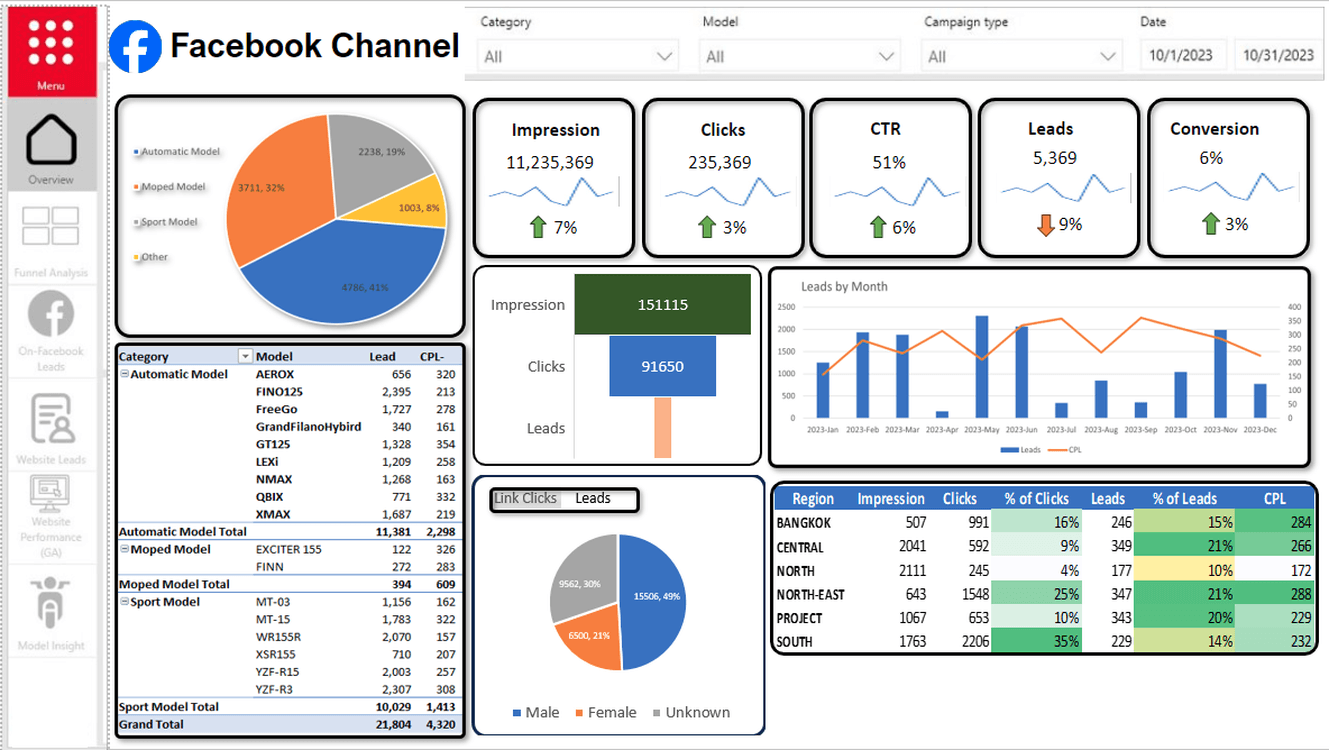
Take this dashboard for example:

Even though the dashboard is well structured, it is still difficult to read with bright and uncoordinated colors making the dashboard difficult to look at.
Here is the same report with a different color theme:

Here the charts look a lot cleaner with colors which are easier on the eyes of the user. This is a great example of how color themes can help create a great dashboard!
Give Context To The Dashboard
Imagine your dashboard says that your company has acquired 1534 new users to the platform last quarter. When someone looks at this number, they might think this is a good sign for the company. However, if we provide some context to the number we will see that in the previous quarter we actually had 2235 new users on board onto the platform indicating a 31% drop in customer acquisition.
This is why context is important!
A Wireframe Example
This wireframe shows exactly what type of charts and filters we will use for each data point and the final look and feel of the tab. Based on this, the stakeholders can provide feedback to tweak with the dashboard design as required.
And the best part:
Once we have finalized the wireframe, it makes the life of the dashboard developer much easier when executing the design in a visualization tool such as Power BI.
To know more about dashboard development, you can go through this article to know how to build a Power BI report from scratch.
Summary
Dashboard design is one of the most underrated aspects of dashboarding which is often overlooked by dashboard developers. In my role as an analyst, I have seen the effect a good dashboard design can have on the end user which is often your boss or higher management. Oftentimes a good design can have a good impression on the stakeholders which leads to better acceptance of the dashboard.
Next time you build a new dashboard, try to incorporate the points discussed in this dashboard and see how it helps in creating the final dashboard!
FAQs
Can you design a dashboard in Excel?
Excel is a super versatile tool to do a bunch of stuff which are data related. You can design a dashboard using Excel as well. However, doing so will mean extensive manual work which could very easily be done using tools such as Balsamiq, Sketch, Figma etc.
What is Figma in dashboard design?
Figma is used to create, design and test different layouts for websites and other digital products. It helps in design process collaboration in team environments, provide feedback and make better decisions much faster.
What are dashboard design templates?
Dashboard design templates are pre-designed layouts that provide a user interface for creating data reports and create dashboards faster with proper designing. These templates provide a starting point for building dashboards, helping BI developers and analysts to quickly build visually appealing dashboards without having to start from scratch.
Related to Dashboard Design