Reports and Dashboards
Written By: Sajagan Thirugnanam
Last Updated on September 23, 2026
Good Power BI data visualization means matching the chart type to the question you are answering, modeling the data on a star schema so visuals stay fast, and limiting each report page to the visuals a user actually needs. The sections below cover each of these, plus the DAX, interactivity and community resources that support them.
Know Your Audience First
Before building anything, identify who will use the report: their technical level, their domain knowledge and what they actually need to decide from the data. A visualization built for a finance director asking "are we on target" looks different from one built for an analyst investigating why a number moved. Tailoring visuals to the audience is what makes a report drive action instead of sitting unread.
Choose the Right Visualization
Power BI offers a wide set of chart types: bar charts, scatter plots, maps and more. As a starting point:
To compare categorical data, use a clustered bar chart or a stacked column chart.
To show a trend over time, use a line chart or an area chart.
To show geographical data, use a map visual.
Manage Large Data Volumes
A few techniques keep a report responsive as the underlying data grows:
Use query folding so transformation steps run at the data source instead of in Power BI, which cuts the volume of data transferred.
Summarize and aggregate data so visuals display fewer, more meaningful data points instead of raw row-level detail.
Apply filters and slicers to limit how much data loads into a visual at once.
Use Custom Visualizations
Beyond the built-in chart types, you can install custom visuals from the Microsoft AppSource marketplace, including Sankey diagrams and word clouds. Power BI also supports R and Python scripts for calculations, statistical analysis or custom visuals the built-in library does not cover.
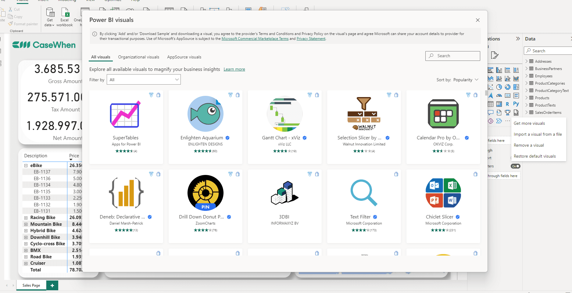
The Power BI visuals marketplace, opened from Power BI Desktop.
Add Interactivity: Drill-Through, Cross-Filtering and Tooltips
Power BI supports several interactive behaviors on top of the visuals themselves. Drill-through lets a user click a data point and navigate to a detailed target page. Cross-filtering lets a selection in one visual filter the other visuals on the page. Tooltips show extra detail on hover without adding another visual to the page.
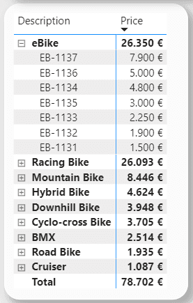
A drillable matrix visual. Expanding a category row is a form of drill-down within a single visual.
Model on a Star Schema
A star schema organizes data into a central fact table, holding quantitative data such as sales transactions, surrounded by dimension tables that hold descriptive attributes such as customer, product or date. A model can have more than one fact table. This structure keeps queries simple and fast, which is why it is the model Power BI is built to perform best against.
Star schema and snowflake schema are the two common approaches, and they trade off differently on query speed versus data normalization. Our star schema vs. snowflake schema guide covers that comparison in depth, along with when a snowflake structure is still the right call. For general modeling guidance beyond schema shape, see our data modeling best practices.
Use the Right DAX Expressions
DAX (Data Analysis Expressions) is the formula language behind measures and calculated columns in Power BI, Excel and Analysis Services. A simple measure looks like this:
A more advanced measure combines functions, such as this churn rate calculation:
Writing measures correctly, rather than relying on default aggregations, is what keeps calculations accurate as a report grows more complex.
General Layout Techniques
Left to right, top to bottom. People read a page left to right and top to bottom, so put the most important information in the top left.
Limit the number of visuals per page. Fewer visuals means faster load times and a page the reader is not overwhelmed by. Our dashboard layout and formatting guide covers page layout in more depth.
Edit interactions. Control how visuals on a page filter or affect each other, rather than leaving every visual to filter every other one by default.
Use Performance Analyzer. It shows how long each visual takes to load and render, which helps you find the bottleneck when a report feels slow.
For the broader design principles behind a well-laid-out page, see our guide to dashboard design.
Use the Power BI Community
The Power BI community is a resource for both new and experienced users. Its forums, blogs and user groups are a place to ask questions on data modeling, visual design or advanced analytics, and to see how other people solved a similar problem.
Sources
Understand star schema and the importance for Power BI - Microsoft Learn
Publish Power BI visuals - Microsoft Learn
Create Power BI visuals using Python in Power BI Desktop - Microsoft Learn
DAX overview - Microsoft Learn
Related to Reports and Dashboards